|
|
Canvas
6™ Technical Manual Project
Part 2B - Create The Master Pages |
 |
|
|
|
|
|
|
Return
To Technical Manual Project Index
The next phase of the master page setup is to create
the column guides for the text objects. Because this
is a technical manual, we are going to setup the layout
using a "one-third/two-thirds" format. The
text objects on each page must have a consistent size
and location and Canvas offers several ways to accomplish
this.
We can either:
a.) Use the Column Guides command or Section tool to
create text sections on the master pages
b.) Create separate text objects in the document pages
then link them with the Text Link tool, or
c.) Create the first text object on page one, then create
the necessary text objects by flowing the overset text
onto succeeding pages.
In this case, it is easiest to create text sections
on the master pages with the Column Guides command.
With only a single click, text objects having a consistent
size and location can be created on each page.
Before invoking the command it is necessary to understand
how sections work and do a little planning in order
to create precise columns. When the Column Guides command
is invoked, Canvas will confine the section within the
margins. We can use this to our advantage and temporarily
change the margins to create the section, then restore
them to their intended dimensions.
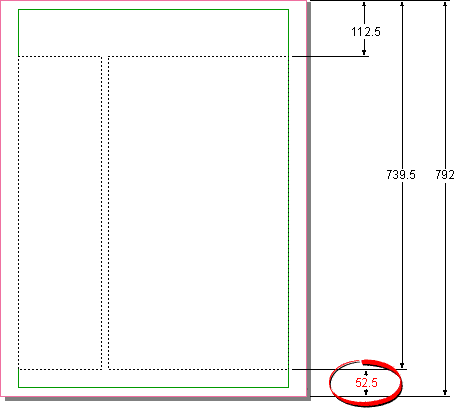
9. First we must determine the dimensions of the text
objects and their locations. In this case we want the
x-coordinates of the text columns to be at 112.5 points
for the top and 739.5 points for the bottom. Margins
are always measured from the outside edges inwards,
so we have to subtract 739.5 points from 792 points
in order to derive the size of the temporary bottom
margin. In this case it will be 52.5 points:
The next concept to understand about sections is that
the finished size of the text objects within a section
will be narrower than the width of the columns as defined
in the section.
To compensate for this:
a.) Each column in the section needs to be created 4
points wider than the actual text object
of the column (2 points per side - right and left).
b.) Each gutter in the section needs to be created 4
points narrower than the actual gutter
(2 points per side - right and left).
c.) The width of the section needs to be 8 points wider
than the margins for the text objects to be flush with
the margins (4 points per side - right and left).
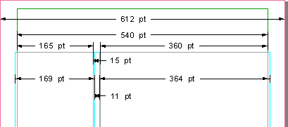
10. In the diagram below, the widths of the finished
columns are 165 points and 360 points with a 15 point
gutter. The total width of the columns from the left
to right margins is 540 points. Since the section needs
to be 8 points wider than the space occupied by the
columns, we need to temporarily reduce the left and
right margins to 32 points each. The width of the section
columns are 169 points and 364 points with an 11 point
gutter. When you plan your own documents, it will go
faster if you sketch it out.
11. Start by clicking Layout > Document Setup
to temporarily change the margins. Enter data according
to the example below. Click "OK" when done.

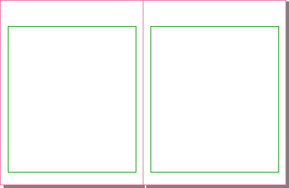
12. This is a view of the masters with the temporary
margins.
13. Now create the section by clicking Layout >
Column Guides. In the dialog (below left) next to
"Preset column guides:", click the one third/two
thirds icon. Choose "This page" for "Apply
to" (that will apply the section to both pages
in the spread). Next, click the "Fixed gutters"
check box. In the "Size" section, enter 169
points for column 1 and 11 points for the gutter. Next
click the pulldown next to the "Column #"
and choose column 2. Enter 364 points for column 2 (below
right). Click "OK" when done.
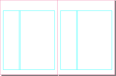
14. The masters should now look like the example below.
When you create a section, Canvas automatically creates
a guide layer and places the section on it.
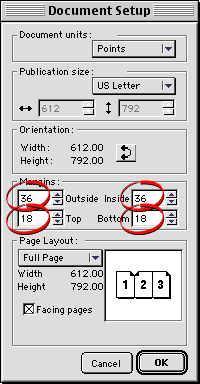
15. Next, restore the margins by clicking Layout
> Document Setup. In the dialog, enter 36 points
each for the left and right margins, and 18 points each
for the top and bottom margins. Click "OK"
when done.
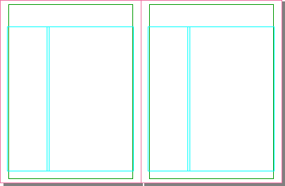
16. The master pages should now look like the example
below.
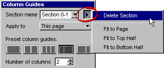
Note: Double-click the section
with the Section tool  to access the Column Guides dialog to make changes to
the section. If you need to delete the section, click
the triangle on the left side of the palette and choose
"Delete Section".
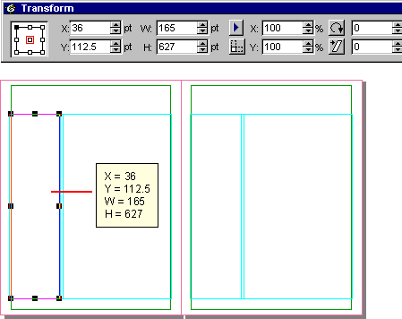
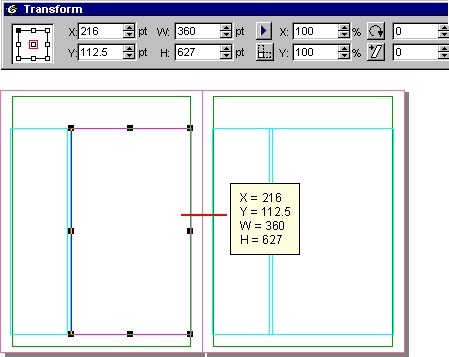
17. Using the Text tool  you can test the section by creating text objects and
checking their measurements. Bring up the Transform
palette and with the Text tool, click anywhere in one
of the columns. Switch to the Selection tool and click
the column to select it. In the Transform palette you
will see the x and y coordinates of the finished text
object along with its width and height:
18. Select the next column and check it as well. When
you have finished checking these columns, delete both
text objects because these are the master pages we are
working on and we don't want these objects repeating
throughout the document.
Click Here To Continue...
|