| |
|
|
Dressing
Up A Dingbat With Photoshop®
|
 |
|
|
|
|
|
|
Dingbats and other symbol fonts are a great source
of clipart. In this tutorial we will use Photoshop to
add some pizzazz to a dingbat. The font used is Zapf
Dingbats. It's one of the Base 14 fonts that comes with
the Adobe® Acrobat® Reader (download
free here).
1. Start by making a new 290 x 200 pixel RGB image with
a transparent background. Using the default foreground
and background colors, click on the image with the Type
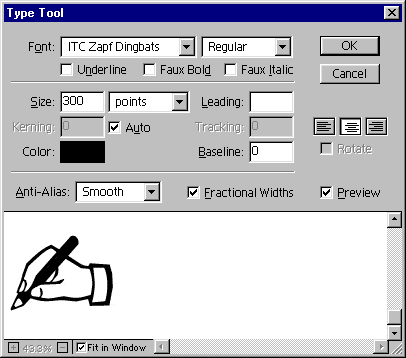
Tool. In the dialog, choose 300 point Zapf Dingbats
with Smooth anti-aliasing. Click the mouse in the typing
box then press the minus sign on the keyboard. That's
the hand and pencil symbol.
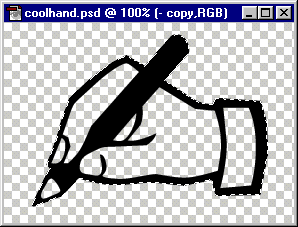
2. Select the Magic Wand Tool  and with a tolerance of zero and with anti-aliasing
enabled, click anywhere in the transparent background.
Click Select > Inverse, then Select >
Save Selection and save the selection to a new channel.
Next copy the layer by dragging it onto the new layer
icon at the bottom of the Layers palette. This will
make an exact duplicate of the layer so the pixels will
line up perfectly.
3. Double-click the new layer to put you back into the
Type Tool dialog as in the previous step. Using the
Shift key, highlight the text in the typing box then
click once on the color swatch to access the Color Picker.
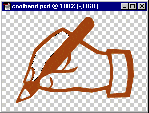
In the RGB boxes enter 181 for red, 86 for green and
6 for blue. Click "OK" twice. We need this
dark sienna color when we use the frosted glass distortion
filter. After applying the new color click Layer
> Type > Render Layer. Next, click the magic
Wand inside any one of the hollow areas of the hand.
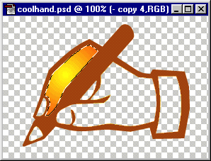
In the example below, the forefinger is selected. Click
Select > Save Selection and save the selection
to a new channel.
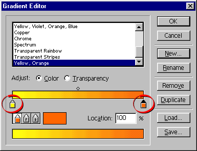
4. Click the Radial Gradient Tool  then click the "Edit" button in the Options
palette. In the Gradient Editor dialog (below), click
the "New" button. Give it a name (e.g. "Yellow,
Orange"). Double-click the starting color stop
(circled - on the left) and set the RGB values to 255,
255, 0 respectively. Next double-click the ending color
stop (circled - on the right) and set the RGB values
to 255, 128, 0 respectively. Use the default locations
for the starting color stop, the midpoint and the ending
color stop (0%, 50% and 100% respectively). Click "OK"
when done.
5. Drag from the center of the selection outwards then
release the mouse to apply the gradient to the hollow
area of the forefinger. The strategy here is to make
separate selections for each of the hollow areas, save
them each as new selection channels then fill them with
this yellow, orange gradient.
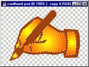
6. After selecting and filling each of the hollow areas,
load each of the selections created from the hollow
areas using the "Add to Selection" option
in the "Load Selection" dialog. You can then
save this composite selection as a new channel. The
reason we filled each area separately is to add depth.
If all the areas were selected then filled as a unit,
the image would tend to look flat.
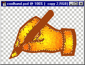
7. Next click Filter > Distort > Glass...
and in the dialog enter the following values:
Distortion
Smoothness
Texture
Scaling |
5
3
Frosted
100% |
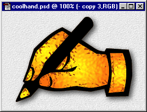
The effect should look similar to the example below. If
we had not used the dark sienna color for the hand dingbat,
there would have been a black reflection on the ridges
of the simulated glass.
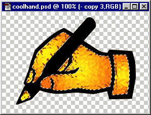
8. Click Edit > Copy then select the black layer
and click Layer > Type > Render Layer then
Edit > Paste Into. This will copy the selection
and paste it into the black version of the hand. If everything
looks okay select "Merge Down" from the layer
options menu to merge the selection into the layer.
9. The Layers palette should look something like the example
below. Click layer 1 to activate it then hide the other
layers (click the eye icons to toggle visibility).
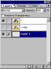
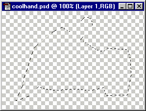
10. Next we'll add a shadow to the image. Click Select
> Load Selection and load the original selection
saved in step 2. Next click Select > Feather...
and feather the selection 5 pixels.
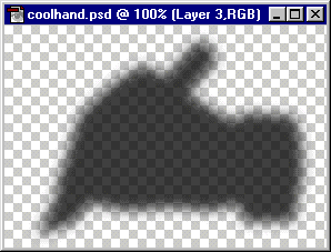
11. Click Edit > Fill, and fill the selection
with 100% Black, Normal mode. Then adjust the opacity
slider on the layer down to about 70%. We want some contrast
between the black outline of the hand and its shadow so
we need to lighten it.
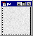
12. If the image will be displayed over a background,
open the background tile image and click Select >
All, then Edit > Define Pattern (click
here for why this is done).
13. Add a new layer under all the other layers then activate
it. Next click Edit > Fill, then choose "Pattern"
for the "Contents" with an opacity of 100%,
Normal mode.
|
|